Components
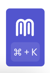
Mendable Floating Button
Before install, make sure you have either signed up through our platform or we have provided you with the ANON_KEY. Without the key, you won't be able to setup the search component.
Mendable Floating Button
The floating button is a fixed button to the bottom right of the screen that will open a modal with Mendable Search. Test out this Mendable component in a sandbox environment.
Usage
import { MendableFloatingButton } from "@mendable/search"

const style = { darkMode: false, accentColor: "#123456" }

const floatingButtonStyle = {
    color: "#fff",
    backgroundColor: "#123456"
}

<MendableFloatingButton anon_key='YOUR_ANON_KEY' style={style} floatingButtonStyle={floatingButtonStyle} />
To customize it with your own icon
import { MendableFloatingButton } from "@mendable/search"

const style = { darkMode: false, accentColor: "#123456" }

const floatingButtonStyle = {
    color: "#fff",
    backgroundColor: "#123456"
}

const icon = <img src="https://www.mendable.ai/images/logo.svg" />

<MendableFloatingButton icon={icon} anon_key='YOUR_ANON_KEY' style={style} floatingButtonStyle={floatingButtonStyle} />
Keyword Search
We also provide keyword search as seen on the Langchain Documentation. This combines keyword with AI Search in one modal. When the user starts typing, it will almost instantly display results for the search query. It also allows the user to use AI search by pressing "Ask Mendable AI".
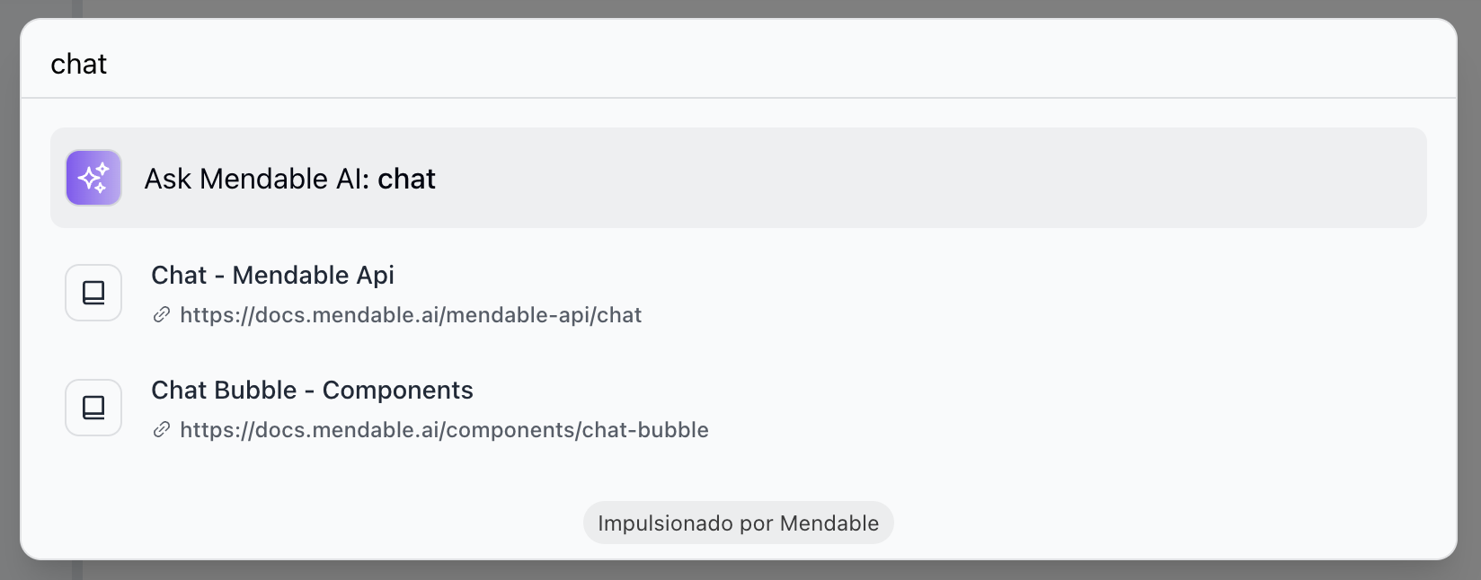
To enable keyword search, you need to pass the showSimpleSearch prop to the component.
import { MendableSearchBar } from "@mendable/search"

<MendableSearchBar anon_key='YOUR_ANON_KEY' showSimpleSearch />
Props
| Prop | Type | Default | Description |
|---|---|---|---|
| anon_key | string | - | Mendable Search ANON_KEY |
| dialogPlaceholder | string | "Search" | Placeholder text of the mendable bot input. |
| context | string | false | Additional context to be passed to the AI |
| icon | object | Mendable Icon | React: Icon HTML tag, can be a img, svg or any other HTML tag, Vanilla JS: image url |
| botIcon | object | Bot Emoji | React: Bot icon HTML tag, can be a img, svg or any other HTML tag, Vanilla JS: image url |
| showPopup | boolean | true | Show the popup on load |
| popupText | string | "Hi, how can I help you?" | Popup text |
| dismissPopupAfter | number | 10 | Dismiss popup after X seconds |
| userIcon | object | User Emoji | React: User icon HTML tag, can be a img, svg or any other HTML tag, Vanilla JS: image url |
| welcomeMessage | string | "Hi, how can I help you?" | Welcome message |
| style | object | - | Style object |
| style.darkMode | boolean | false | Dark mode |
| style.accentColor | string | "#123456" | Accent color |
| style.backgroundColor | string | "#123456" | Background color |
| cmdShortcutKey | string | "k" | What shortcut triggers the search |
| floatingButtonStyle | object | - | Floating button style object |
| floatingButtonStyle.color | string | "#fff" | Floating button color |
| floatingButtonStyle.backgroundColor | string | "#123456" | Floating button background color |
| showSimpleSearch | boolean | false | Show simple search bar option on the top |
| positionOverwriteClassname | string | - | Classname that helps overwrite the position of the floating button |
| messageSettings.openSourcesInNewTab | boolean | false | Open sources in new tab |
| messageSettings.prettySources | boolean | false | Display the sources by title / sub-section instead of long URL |
| messageSettings.hideSources | boolean | false | Hide the sources |
| privacyDisclaimer | string | "" | Privacy disclaimer text |
| footer | object | - | Footer object |
| footer.bottomRightLink | object | - | Bottom right button object |
| footer.bottomRightLink.label | string | "" | Text label for the bottom right button |
| footer.bottomRightLink.link | string | "" | URL for the bottom right button |
| language | string | "" | Defaults to user's personal settings. Anything else will overwrite the language for all users. Languages available: pt,es,fr,it,nl,de,ja |
| onMessageForTracking | function | - | Callback function that triggers when a message is sent. It receives the question and answer as parameters |
| onSourceClickedForTracking | function | - | Callback function that triggers when a source is clicked. It receives the source as a parameter |
| onSwitchingSearchType | function | - | Callback function that triggers when the search type is switched. It receives the type as a parameter |
Callback functions
The MendableFloatingButton component provides callback functions for tracking events inside the component.
- onMessageForTracking : This function is triggered whenever a message is sent in the component. The function receives the question and the answer as parameters. This can be used for logging or analytics purposes.
Example
import { MendableFloatingButton } from "@mendable/search"


function MySearchComponent() {
  const handleOnMessage = (question, answer) => {
    console.log("User asked:", question);
    console.log("Received answer:", answer);
    // You can add additional tracking or analytics logic here.
  };

  return (
    <MendableFloatingButton
      anon_key="YOUR_ANON_KEY"
      onMessageForTracking={handleOnMessage}
    />
  );
}
- onSourceClickedForTracking : This function is triggered whenever a source is clicked in the search results. The function receives the source as a parameter. This can be used for logging or tracking user interactions.
Example
import { MendableFloatingButton } from "@mendable/search"

function handleOnSourceClicked(source) {
  console.log("User clicked on source:", source);
  // Add tracking or logging logic here
}

<MendableFloatingButton
  anon_key='YOUR_ANON_KEY'
  onSourceClickedForTracking={handleOnSourceClicked}
/>
Use these functions to gain insights into how users are interacting with the search bar.